Case study 07 / 08
Design tool plugin
Swatchbook
An open-source design tool plugin that finds near-miss colors in a file and swaps each one for the nearest token that still passes contrast.
- Client
- Open source, sponsored by Halyard
- Year
- 2024
- Role
- Designer and maintainer
- Team
- Ines Okafor, plugin engineering
- Ravi Menon, color science (contributor)
- Joon Park, accessibility testing (contributor)
The problem
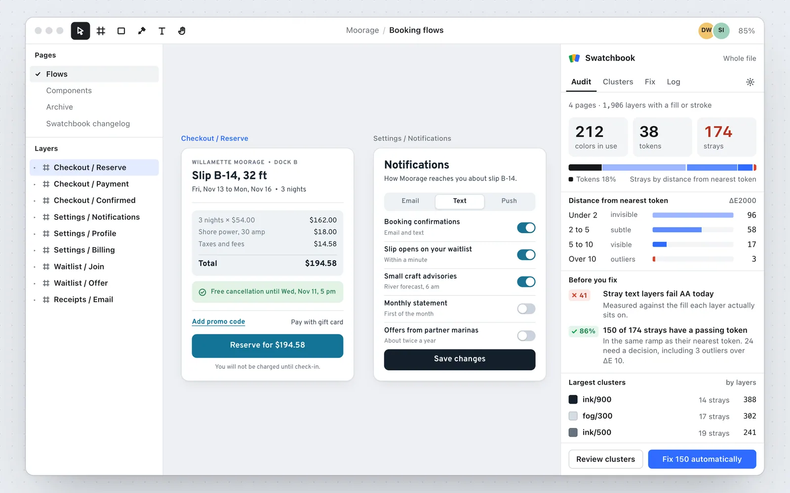
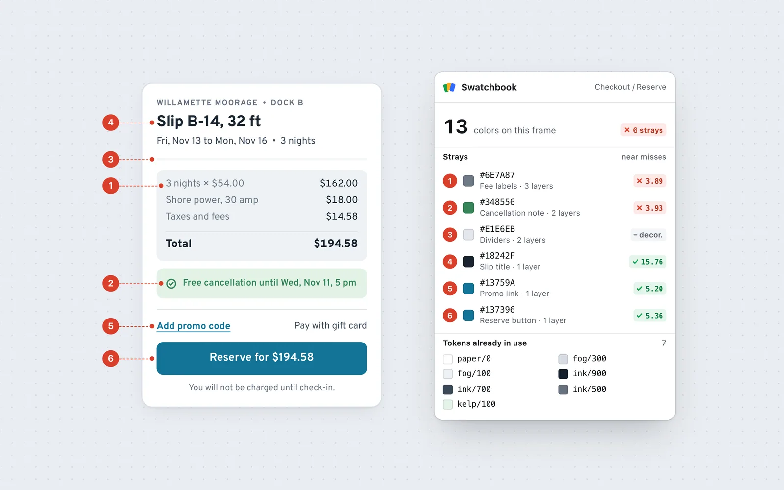
Design files drift. When Halyard audited the booking file of a client, a slip-rental company called Moorage, it found 212 unique hex values against a library of 38 tokens. Most of the extras were near misses nobody could see, like #6E7A87 standing in for #66727F, but 41 text layers failed contrast, and cleaning the file up by hand took a designer three days.
Decisions
- 01
Audit by distance, not exact match
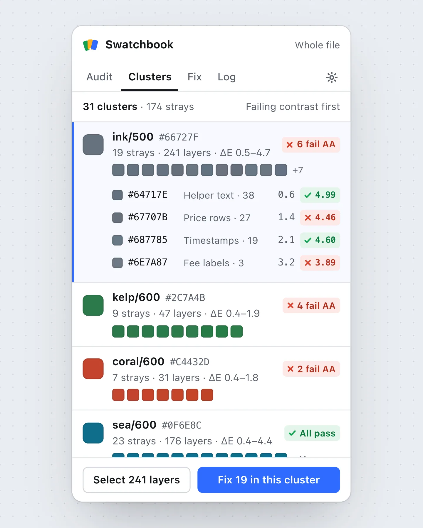
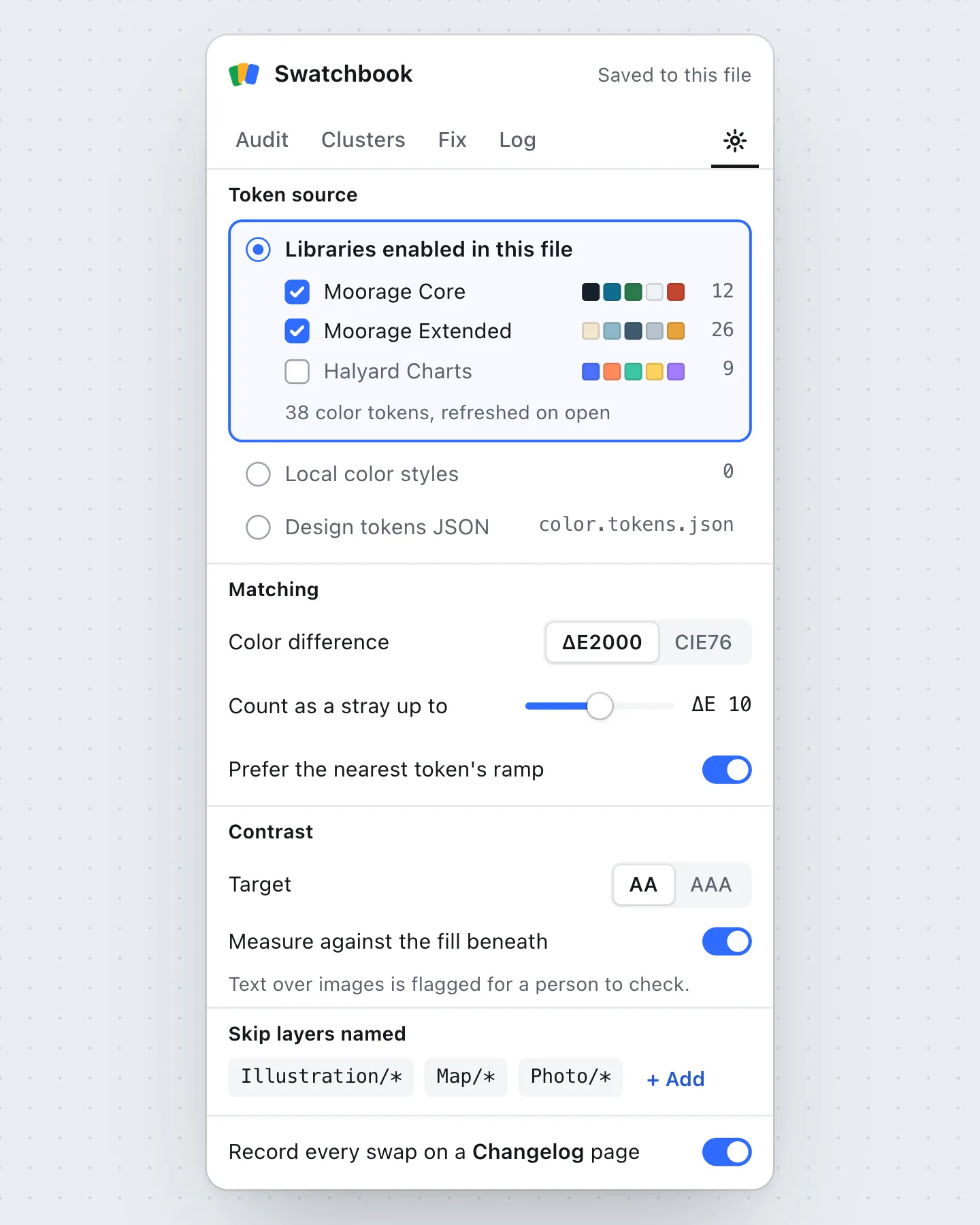
An exact-match search calls #18242F and #14202B different colors, which is true and useless. Swatchbook converts every fill and stroke to CIELAB, measures ΔE2000 to each token, and groups strays into clusters around the nearest one, so 174 strays read as 31 decisions.
- 02
Suggest the nearest token that passes where the layer sits
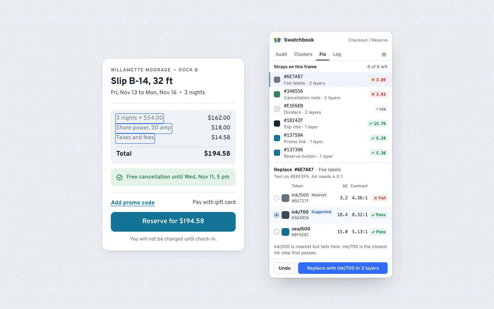
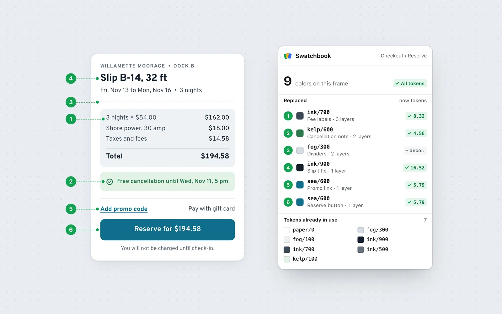
Gray fee labels were closest to ink/500, which passes on white but reaches only 4.36:1 on the gray price box. Swatchbook measures contrast against the fill actually beneath each layer and steps along the same ramp until it passes. My first version searched every token and offered a blue for gray text, so staying in the ramp became the rule.
- 03
One click to replace, one row to undo
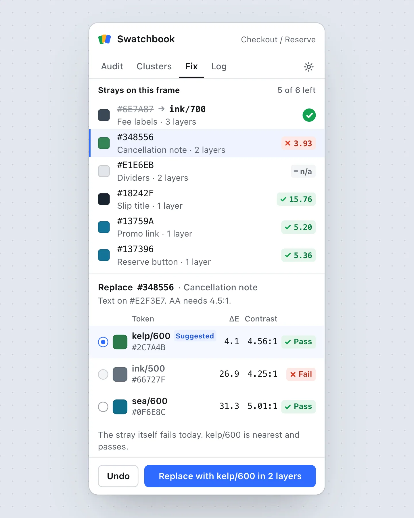
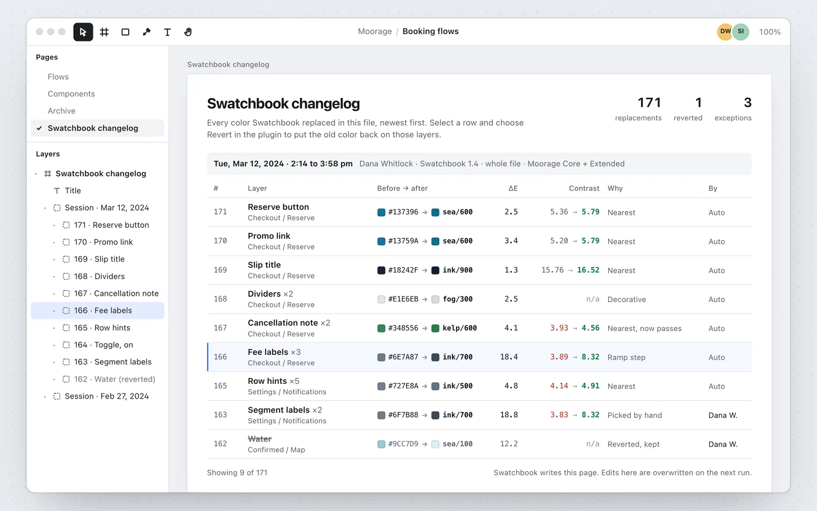
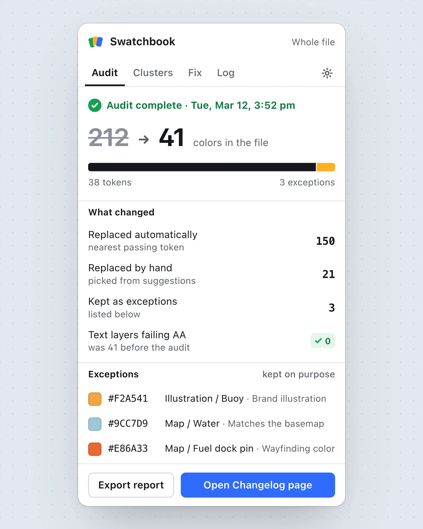
Replacing is a single button, so every swap is written to a Changelog page in the file: layer, before and after, ΔE, contrast, and who ran it. Anyone can revert a row weeks later, which is what made design leads comfortable running it on shared files.
Outcome
Swatchbook has 11,400 installs. An average audit replaces 86% of strays automatically, and Moorage’s booking file went from 212 colors to 41 in an afternoon: 38 tokens plus three illustration colors kept on purpose.
The brief
Halyard, a design-systems consultancy, kept running the same cleanup for clients: export every color in a file, sort the hexes in a spreadsheet, then fix them layer by layer. They sponsored me to turn that routine into a free, open-source plugin that teams could run on their own files.
The constraint was trust. A plugin that quietly rewrites colors across a shared file gets uninstalled after one bad afternoon. So the design had three jobs: show how far each color has drifted, pick a replacement a designer would agree with, and make every change easy to see and undo.
Live demo
Fix the strays on a checkout card
Pick a stray, check the suggested token and its contrast, then Replace. Undo puts the old color back.
Contrast is measured against the fill under each layer: the same gray that passes on the white card fails on the price box.
Why the nearest color was wrong
Fixing every stray to its nearest token would have repaired only half of the 41 failing text layers, because the nearest token often failed too. Designers had eyeballed a lighter gray on a gray background, and the token they were reaching for was built for white.
The ramp rule accepts a bigger visual jump, ΔE 18.4 for the fee labels, to get text people can read. The panel lists the nearest token anyway, marked Fail, so the jump is a visible decision rather than a surprise.
We had been calling it the gray problem for a year. Swatchbook showed us it was nineteen grays, six of them failing on our own price boxes, and we cleaned up the whole booking file before dinner.”
Results
- Installs
- 11,400
- free and open source
- Strays replaced
- 86%
- in an average audit, automatically
- Colors in Moorage’s file
- 212 → 41
- in one afternoon
What I would do next
Swatchbook only trusts solid fills. Gradients and text over photos are flagged for a person, which is honest but slow: in Moorage’s file they were 9 of the 24 decisions left after the automatic pass. The next version samples the pixels under text on images and suggests a scrim token when no text color can pass.