Case study 01 / 08
Marketplace
Stoop
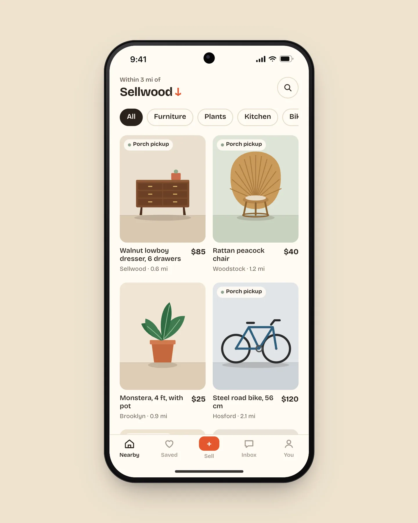
A neighborhood resale app where listing a dresser takes three photos and pickup is booked like a table.
- Client
- Stoop, Portland
- Year
- 2025
- Role
- Lead product designer
- Team
- Priya Natarajan, product
- Theo Brandt, iOS
- Lena Ocampo, Android
- Marcus Hale, backend
The problem
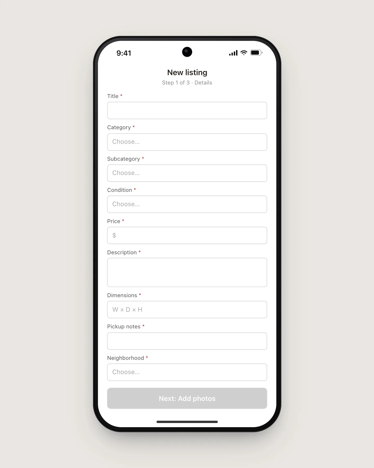
Stoop had plenty of buyers and not enough listings. Sellers quit a nine-field form at a rate of 58%, and the ones who finished then lost Saturdays to buyers who never showed: one planned pickup in three ended with a dresser still on the porch.
Decisions
- 01
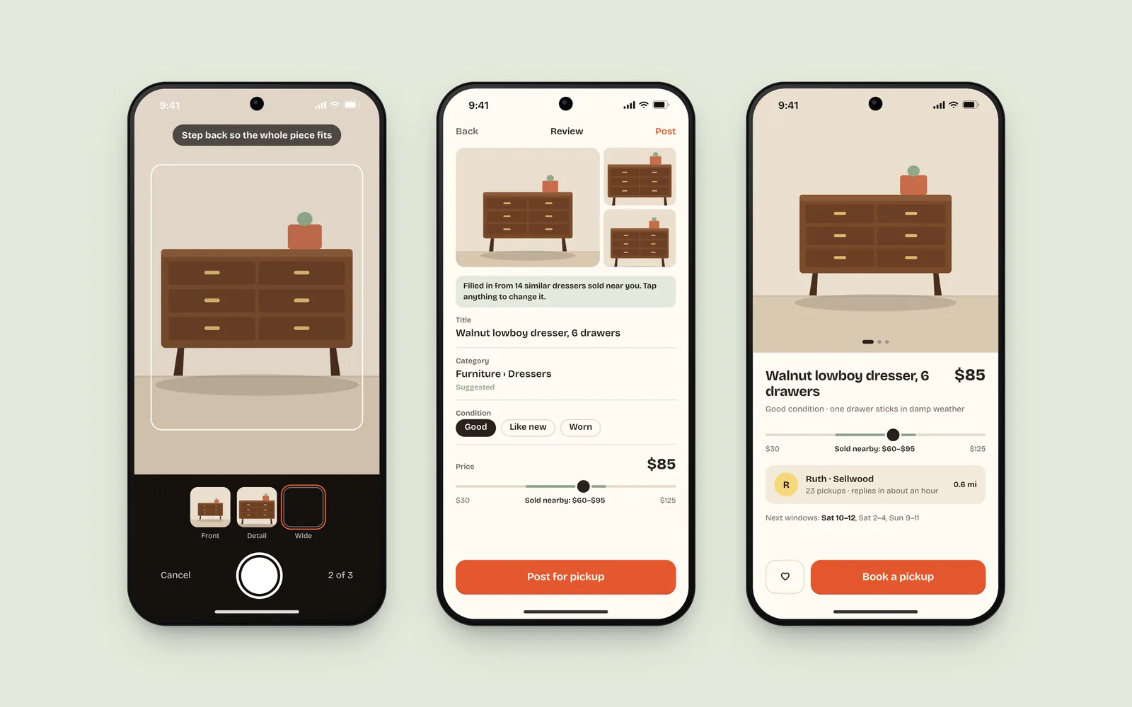
Start with the camera, not a form
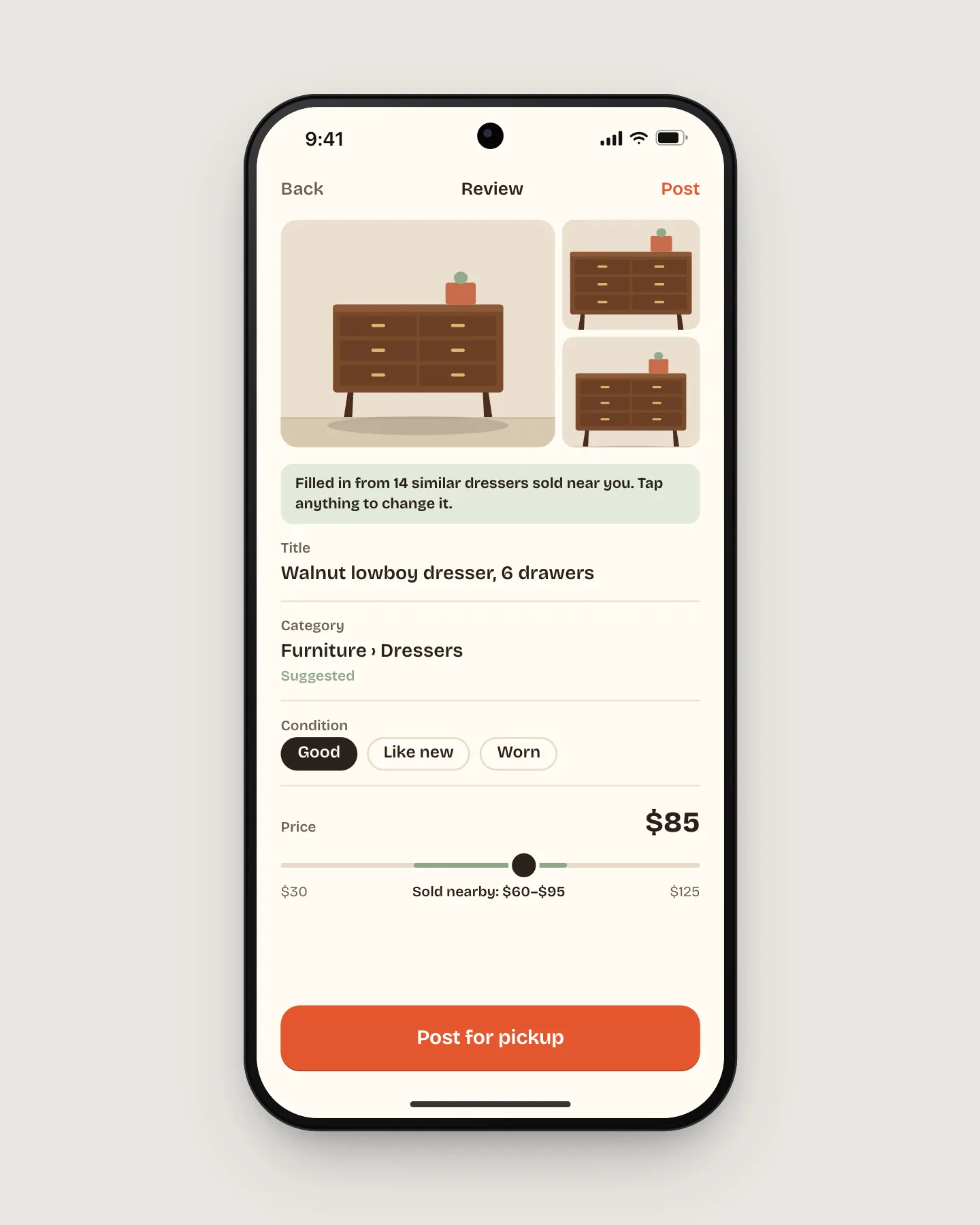
Listing opens on three guided shots. From the photos and 40,000 past sales, Stoop fills in the title, category, and a price range. Every field is still editable, but most sellers just tap Post.
- 02
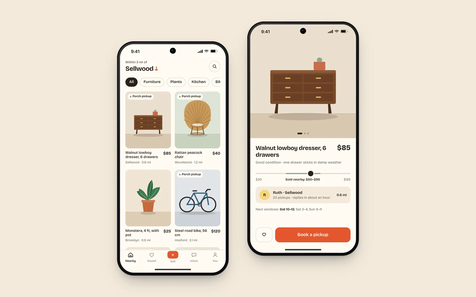
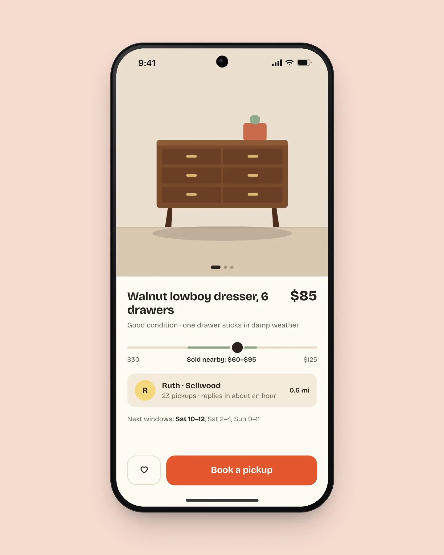
Show prices as what actually sold nearby
A single suggested price felt like the app guessing. A bar of what similar items sold for within two miles gave sellers a reason to trust it and buyers a reason not to haggle.
- 03
Book pickup like a table
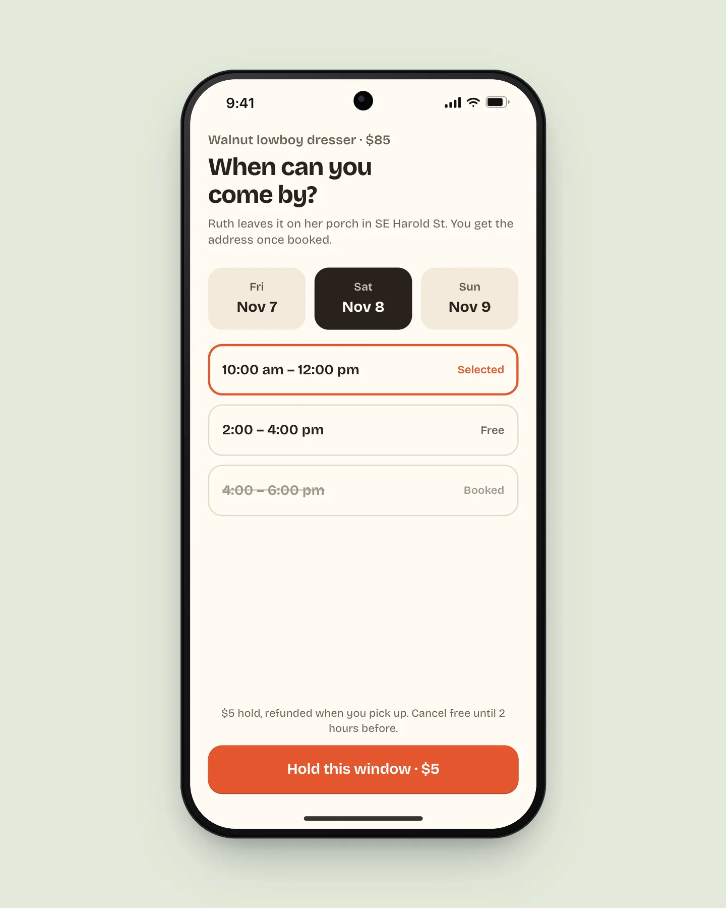
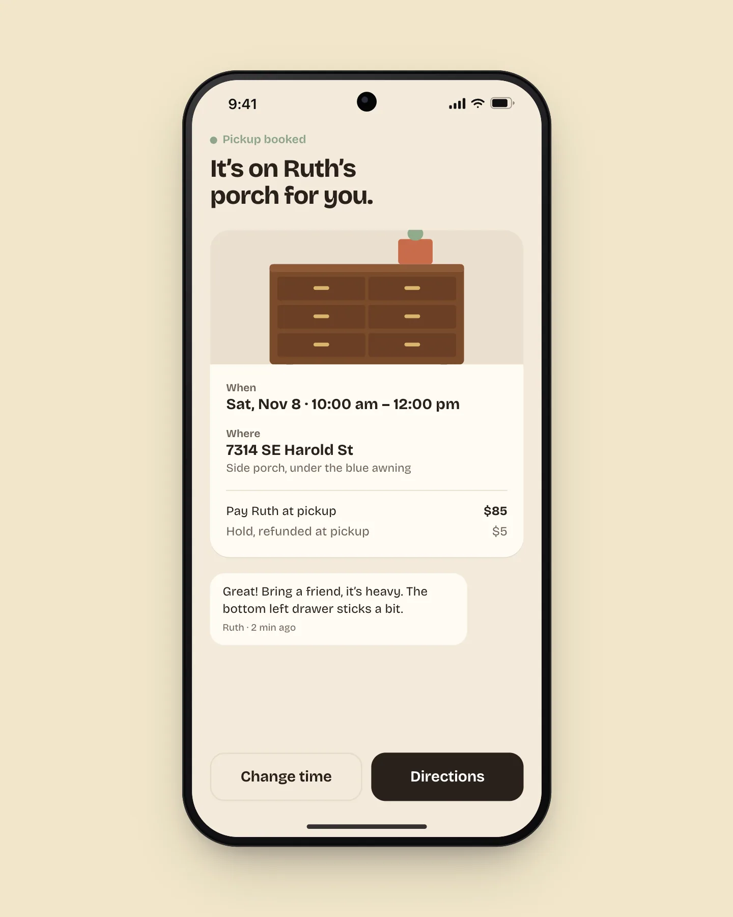
Sellers set two-hour windows when they will be home. Buyers pick one and put down a $5 hold that comes back at pickup. No more “is this still available?” threads that go nowhere.
Outcome
Median time to list fell from 4 minutes 10 seconds to 52 seconds. Pickup no-shows dropped from 31% to 9%, and weekly new listings grew 2.4× in the ten weeks after launch.
The brief
Stoop started as a neighborhood email list in Sellwood and grew into an app for about 30,000 people on Portland’s east side. The founders asked for one thing: more stuff to buy. Their research said sellers were the bottleneck, and the form was the obvious suspect.
Shadowing six sellers showed the form was only half of it. People would happily write a description; what they hated was pricing something they had no feel for, and then waiting around for a stranger who might not come.
Live demo
Book a porch pickup
Pick a day and a window, then hold it. You can change the time afterwards.
Taken windows stay visible but struck through, so buyers can see the seller is real and busy, not ignoring them.
I used to price everything at twenty dollars and hope. Now I can see the dresser down the street went for ninety, so I ask eighty-five and it’s gone by Sunday.”
Results
- Median time to list
- 52 s
- down from 4 min 10 s
- Pickup no-shows
- 9%
- down from 31%
- Weekly new listings
- 2.4×
- ten weeks after launch
What I would do next
The $5 hold works, but it adds a payment step that scares off some first-time buyers. The next test makes the hold optional for buyers with three completed pickups, so trust is earned once and then gets out of the way.